Official Government information that you will not see analyzed on CNN, Fox, NBC, CBS, ABC, PBS etc. Trust THEI to bring your attention to the stories the above mentioned propaganda outlets refuse to report . . . EDITOR
from Sovereign Man
by Simon Black
April 20, 2012
[Undisclosed location]
Here’s a fun way to cap off your week.
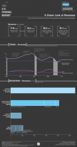
The Congressional Budget Office has just released three very telling infographics which, unintentionally, spell out a pretty dreary picture of US government finances.
The first graphic shows US federal revenue, both in raw numbers ($2.3 trillion in 2011) and expressed as a percentage of GDP (15.4%).
There are a lot of interesting things about this graphic. Check out the massive downward swing of payroll tax receipts starting in 2009… coinciding not only with the dismal rate of employment in the country, but also the demographic trend of having fewer and fewer baby boomers paying in to the system.
It’s also interesting to note that, by comparison, 2011 US tax revenue is roughly twice what is was 20-years prior. Yet over the same period, the federal debt has ballooned nearly five-fold.
The next graphic is mandatory spending– . . . Read Complete Report


Leave a Reply